Creating a queer-focused health start-up's identity 
Queerly Health
branding, design, development, illustration
TL;DR
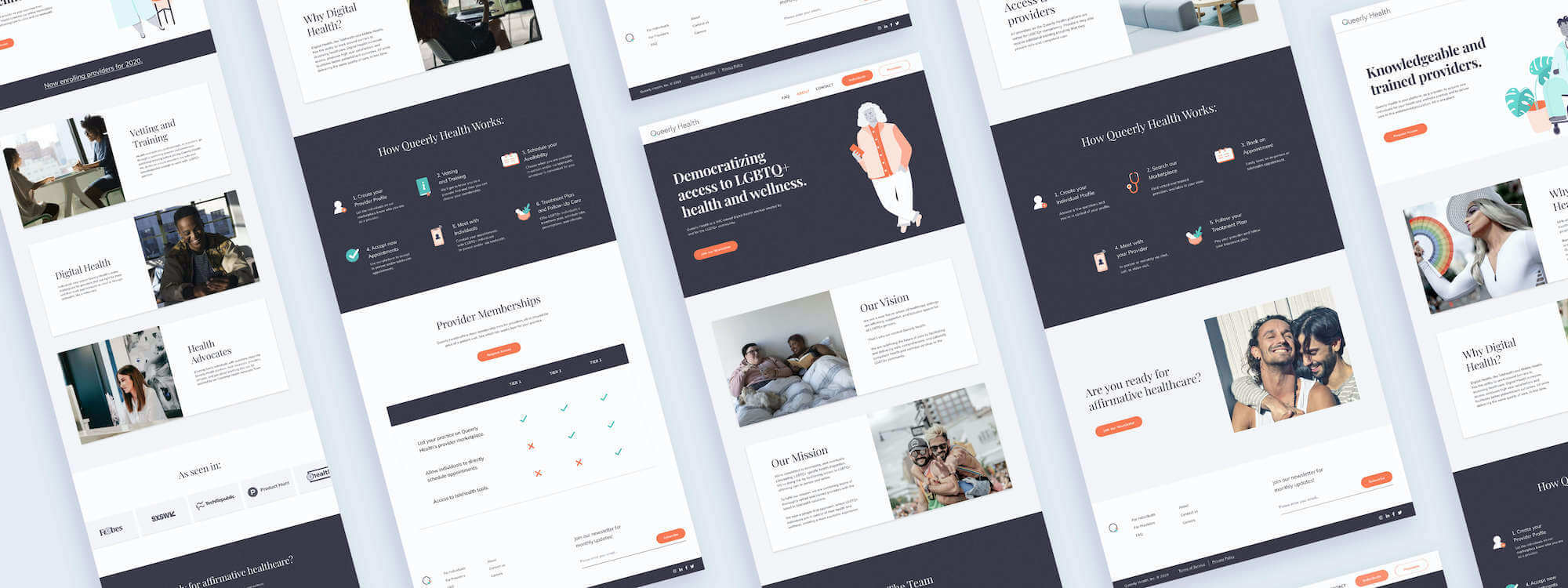
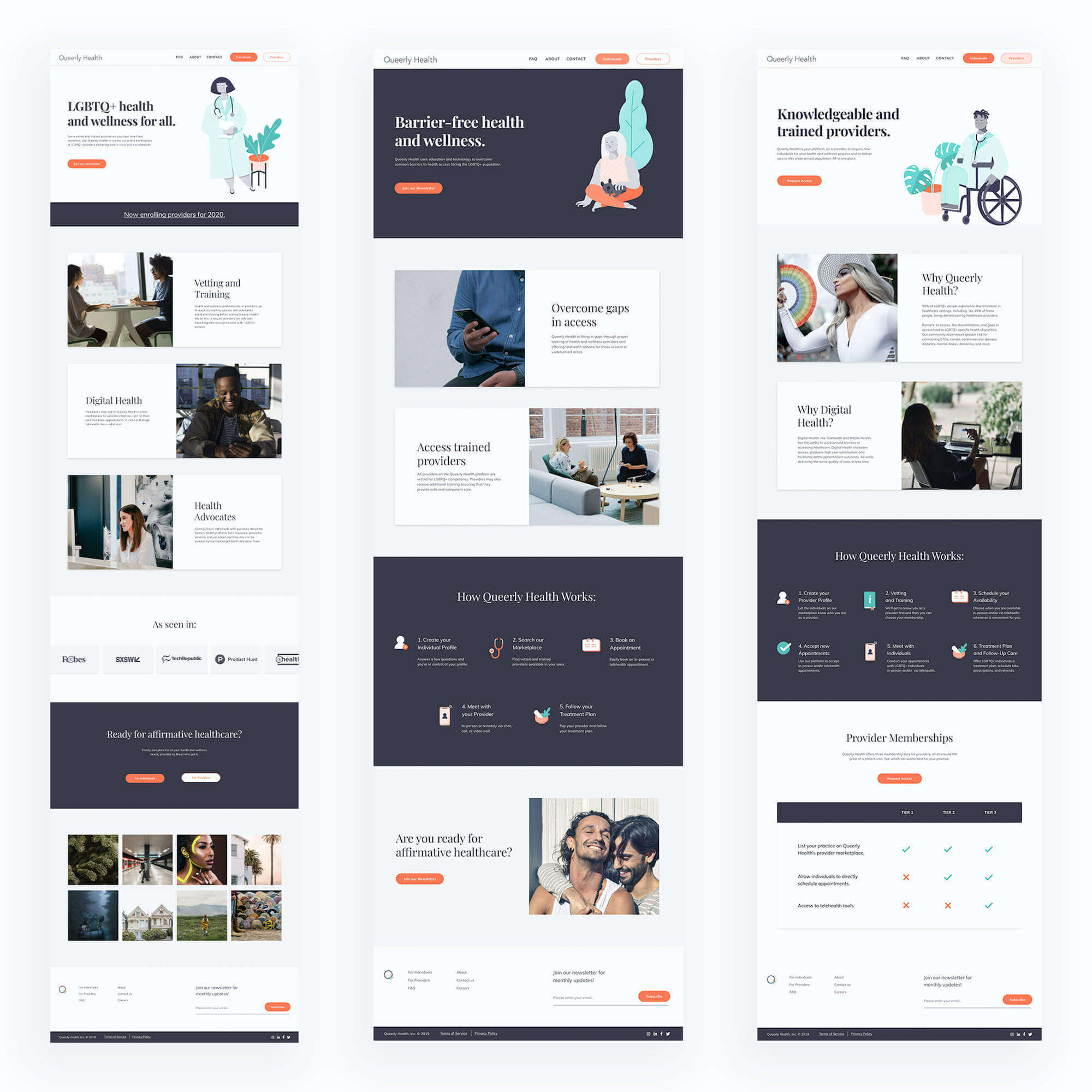
Queerly Health is a start-up focusing on connecting the LGBTQ community with trained health and wellness providers. I was asked to help implement their refreshed brand into their website as well as improve the functionality of the website. The final site implemented a more user-friendly map and a precise and clear call-to-action and can be seen live here.
My Role
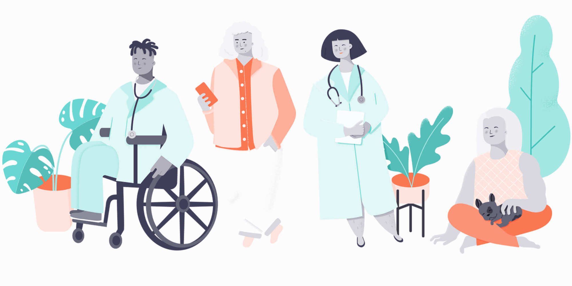
In this position, I lead brainstorming sessions, conducted competitive research, outlined the userflow and did all ui and visual design work including illustrations and webflow implementation.
Why
Queerly Health had a marketing website already, but they had problems getting people to sign up for the newsletter and problems with a confusing site structure. The team wanted to streamline their site as well as implement the brand update that I had helped them create.
Research
We conducted a wide range of competitive research ranging from medical apps to booking apps. We narrowed our focus down to a few high-performing competitors including: Zocdoc, Maven, Tia and One Medical. We also created personas based on our two main customer groups; someone looking for a provider, and the provider themselves.
Iterations
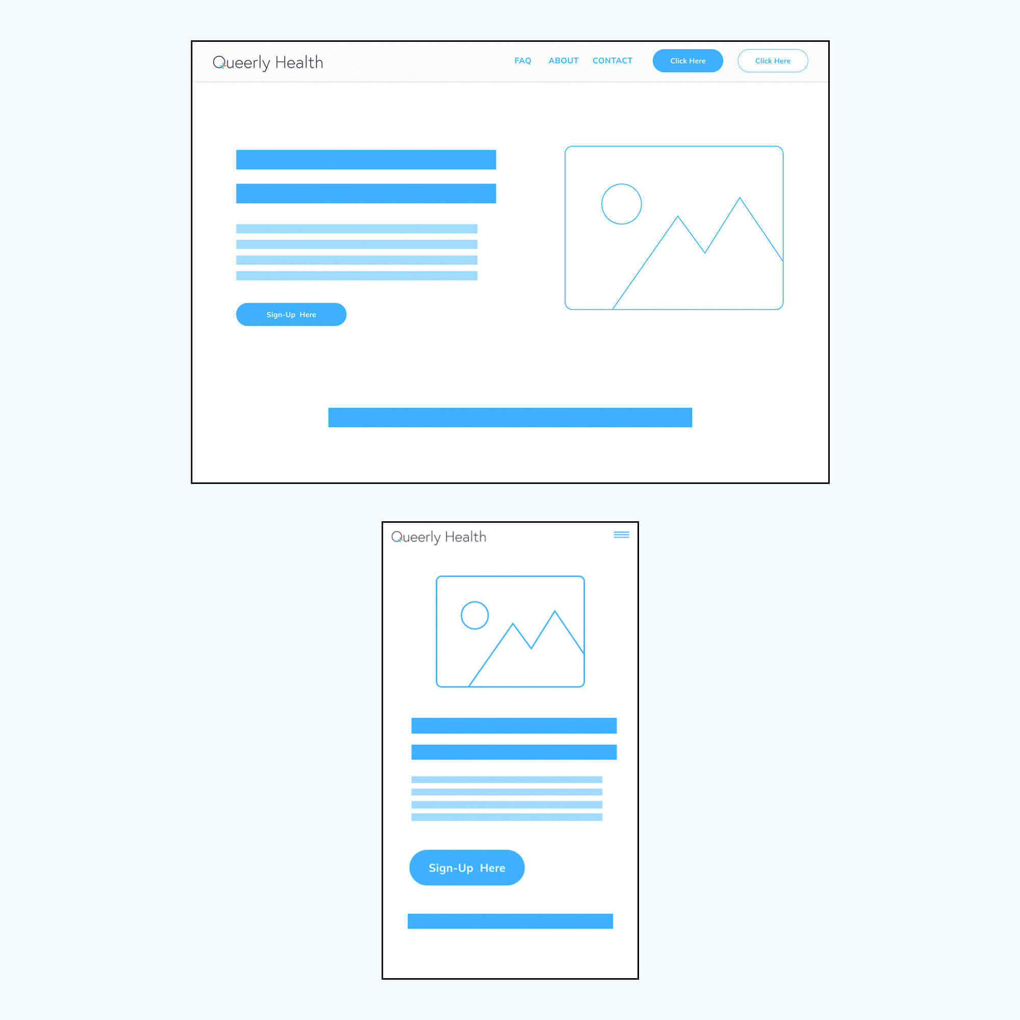
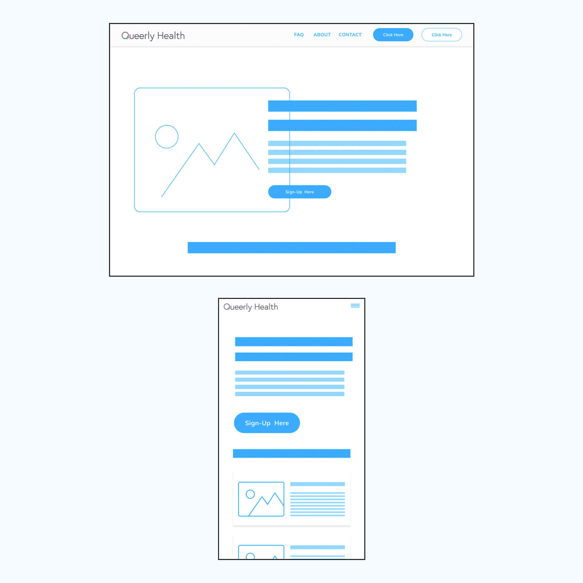
After going through the existing website, personas and user-flows, I started sketching out ideas on paper to explore the easiest way to present information to the user. One of the main functionality changes was making newsletter sign-up easier. Previously, if a user clicked 'sign-up for newletter' they would be punted to a new page that had a form with many inputs including pronouns, age etc. The new design allowed for the least amount of friction, the user can just enter their email and sign-up. After presenting to the stakeholders and choosing a direction, I created low-fidelity wireframes of each page and went through them with everyone. During high-fidelity work, I created components to be used across the platform. The new website was created with the intention of growth. We planned that the landing page would eventually evolve from a marketing page to a functional search page that would move the user through the sign-up and search flow. Therefore, I created a lot of the design as modules that could be moved around, added and subtracted. The resulting website provided a simpler user flow and a clearer call-to action.
Queerly Health is a NYC-based digital health startup created by and for the LGBTQ+ community.
-Queerly Health
Learnings & Next Steps
Looking back, this project should have had more time allocated to the design process. This was a quickly implemented project based on time constraints. I would have also liked to do more user research and spoken to more potential users. This will hopefully be an iterative project and we will continue to update based on the data we get from google analytics and mailchimp.